Honestly this is a hard one. May just be the hardest single game recommendation on steam to date. The tldr is that this is not a negative, but it is not a positive. Read through if you want a bit more information.
Starting out, this is NOT a bad game at all, it is not a mid game or a meh game. It is a good to pretty good game with flaws but solidly in the good category, i want to make this very clear because the game deserves it.
That being said however it most certainly has flaws, quite a few of them, and it most certainly is NOT Frostpunk 2. The decision of calling it frostpunk 2, most likely with monetization and brand recognition in mind is the single most harmful point to this game. Because it reasonably sets expectations to be Forstpunk, number 2. A sequel, a continuation of the first. And it absoulutely is not that. This should have been a spinoff, its own thing in the frostpunk universe. not only would it have allowed huge freedom in direction, systems and details but it would also have left the spot open for a true successor to Frostpunk. It would have removed so many of the games negatives immediatley and allowed it to be judged on its own merits and issues. But alas this is not what we got, we got a lazy grab for the brand recognition and money that comes with it, and as such as i can only vote yes, or no, it also comes with effect on that vote.
Frostpunk was a narrative experience in the shape of a colony management/city building game. It didnt sit perfectly in one genre or the other but it was solidly in that area. This game is nothing of the sort. It is a 4x/grand strategy-lite with city state management flavour. It is a complete change in genre, it is to a adjacent one, very adjacent, but it is notheless dramatically different.
Frostpunk thrived on the intimacy you had to your colony, even to a extent to your colonists even if they were only bips on the map. You saw them thread through snow to work, you saw the paths and you saw the heated walkways and areas you built. You managed individual workplaces in intimate detail even it was not very in-depth. You rose with the music and the success or failures of your colony and it all blended together to a masterpiece of a experience. It was incredibly short and limited but it did it so well it was well worth its price.
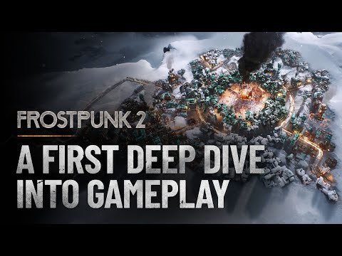
Frostpunk 2 has none of that. You dont have people, you have entire population groups, percentages and numbers. You dont even see the people except as lazy doodads making snow angels on pathways where there is no snow. Even the walkways are blended into a shining light as if there are superluminar cars zipping past and forth. You have entire districts that you dont give a fuck about. 200 people die? Who cares? You set percentages in workplaces and you put entire districts adjacent to one another. There is no intimacy, people are an annoyance and they should get out of the way of the numbers.
This is the issue. The game is not Frostpunk 2, it is The Frostlands, New Londons legacy.
Game itself has tons of issues. The parliament system is great. one of the best ive seen despite its simplicity, exactly because it is that simple. UI is horrible, clearly style over function while trying not to do it, ending with a mess that is neither. I appreciate the remaining function but wish there was more as this more of a 4x/grand strategy game. The Factions are much to simplistic and they break their own logic. In short the entire faction system needs a rework. Make them less of full packages for obvious gameplay reasons and make them groupings. Maybe they wont have interests in everything but that is ok, there are special interest groups. Make those with interests in everything more muted, just as real life. Maybe make unreasonable radicals and add systems of managing them or pandering to them, but allow the choice and counterplay. You are forced into obvious gameplay chokepoints and the game suffers from it, it is lazy and it is not very fun. There is no reward for playing good, you will be forced into a bad position no matter how well you manage,
Overworld exploration is meh, at best, all flavour or feeling is taken out from it and it has become a clicking simulator where you look at numbers and ignore the rest. Lore and setting has been broken from Frostpunk 1 and research is less research and imply unlocking decisions for policy, calling it research is absurd, call it comitee work instead. Honestly entire system needs a revamp and if they want to stick to this it needs research, comitee and council as separate systems. With separate effects and only at times linking to eachother, it needs to be more complex and make more sense. Research for direct effects and options, unlock comitte work which allows decisions in council. And wise versa for the the fringe stuff and other choice options. Game does not have this, because it remains chained to frostpunk, and yet it is not frostpunk 2, so it is just a weird middle ground where it is nothing.
Game is also short, very short, and some of the transitions are absurdly jarring and undercooked, bordering on lazy or just incompetent. And it honestly feels like it is kept so in favour of dlc, so they can squeeze us for money. It feels like modern paradox , not as far gone and much lighter, yet still paradox. And you do NOT want to take inspiration of paradox and their absoulutely disgusting direction and behavior, it is greed pure and simple. The game is not there yet but if it stays on course it will be sooner rather than later.
Now it may sound like it is a bad game at this point, but I repeat, this is a good game. But honestly it is one of those rare options where all reviews i read, positive or negative, are making almost always 100% valid and reasonable points. Game is good but swims in issues, fans who built the franchise have been betrayed. Yet the game is good and i want to see more of it, in the long run i may even like it more than "Frostpunk". I want "The Frostlands 2", but i also want Frostpunk 2, and i have not yet gotten it.
In the end it took writing this review to decide on my vote, i come out as a not recommended, mainly because i feel uncomfortable with the rising score and how it seems to ignore the absolute plethora of issues on all levels. And anyone coming into this expecting "Frostpunk 2" wil be sorely disspointed. It is a good game, i like it, but i cant recommend it and this solely lies on the head of the developer or publisher that decided on the course of the game.

izigame.me
It may take some time when the page for viewing is loaded for the first time...


